GOALS:
Revitalize Shine's free sample (lead) ads to get their work in the hands of more prospective clients.
Revitalize Shine's free sample (lead) ads to get their work in the hands of more prospective clients.
Create several different styles of ads that show the beauty of Shine's invitations
to keep the ads fresh.
to keep the ads fresh.
Test ads on TikTok to see if that would be a useful advertising avenue for Shine.
RESULTS:
44% increase in the number of samples ordered from the previous year.
44% increase in the number of samples ordered from the previous year.
Kept average CPA well below Shine's target.
Brought in more clients for 2023, but Shine now has a larger base of clients with weddings
taking place in 2024, 2025, and beyond.
taking place in 2024, 2025, and beyond.
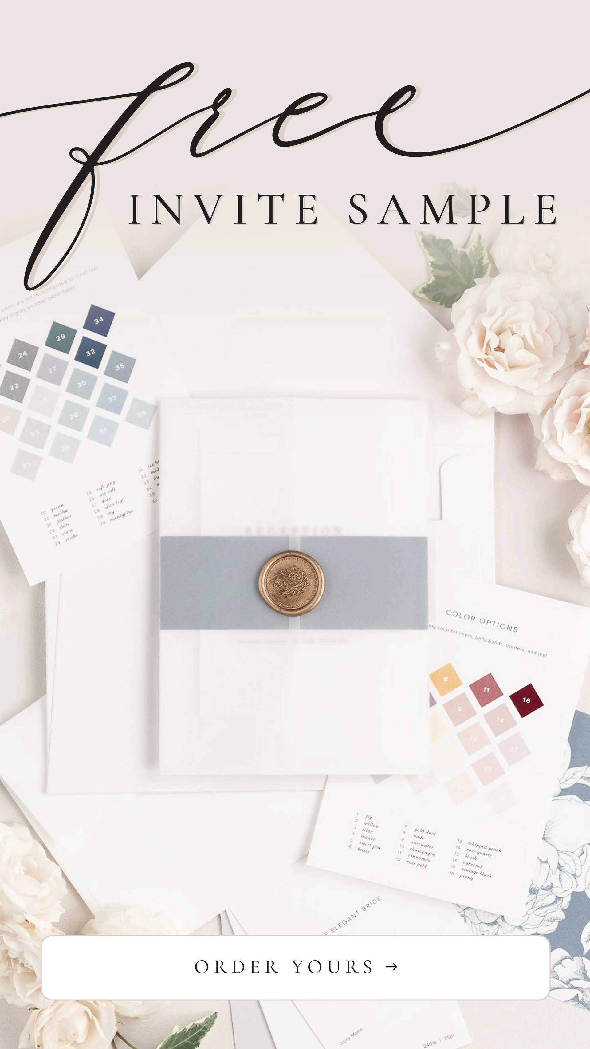
The Idea Behind the Ad:
This was the first ad I created for Shine, and the main idea was to show that they offer complete wedding stationery suites from start to finish. This particular design is beautiful, and easily one of the most popular designs. Following all of these beautiful images with a short and to-the-point call to action proved to be very effective.
This was the first ad I created for Shine, and the main idea was to show that they offer complete wedding stationery suites from start to finish. This particular design is beautiful, and easily one of the most popular designs. Following all of these beautiful images with a short and to-the-point call to action proved to be very effective.
Launched on:
Instagram | TikTok | Pinterest
Instagram | TikTok | Pinterest
The Idea Behind the Ad:
Letterpress printing is one of Shine's most popular products, and we wanted to feature it prominently in their advertising. This particular ad is based on a video that did very well on Instagram organically.
Letterpress printing is one of Shine's most popular products, and we wanted to feature it prominently in their advertising. This particular ad is based on a video that did very well on Instagram organically.
We wanted to try to capitalize on the less formal style and see if it would do as well in a promoted setting as it did organically. It did very well and helped to broaden our strategy to include less formal ads.
Launched on:
Instagram | TikTok
Instagram | TikTok
The Idea Behind the Ad:
The CEO of Shine wanted to try a user-generated content (UGC)
style video, but we weren't entirely sure how to make that style work for
free samples at first. I thought it would be interesting to frame the video around an expert sharing why a bride should order an invitation sample before placing an order.
I wrote this script and was on camera myself, which was really fun to do! I enjoyed the creativity of this video style, and I loved being able to share my expertise in this area.
This video ad did well, but we did find areas to improve.
More on that below.
More on that below.
Launched on:
Instagram | TikTok
Instagram | TikTok
The Idea Behind the Ad:
While the original version of this video did well in terms of the cost
per action (CPA), we weren't getting as many samples from it as I originally wanted. When I went through the analytics from the original video, I noticed that there was a significant drop off in the number of viewers after the first few seconds of the video.
Since the first few seconds of the original video were simply of me, I thought it might help to include a green screen effect from the start. That way, there'd be more going on to capture attention.
I also took this opportunity to shorten the video to include three reasons, instead of the original five reasons.
The changes proved to be good ones! This ad was more successful than the original version, in both CPA and the number of samples ordered.
Launched on:
Instagram | TikTok
Instagram | TikTok
The Idea Behind the Ad:
As part of my position at Shine, I was in charge of analyzing all results from ads on a daily basis. Early on, I wanted to test our initial ads in all placements to see what type of ad was going to resonate most in each placement.
As part of my position at Shine, I was in charge of analyzing all results from ads on a daily basis. Early on, I wanted to test our initial ads in all placements to see what type of ad was going to resonate most in each placement.
In the results from those early tests, I noticed that 1x1 ads placed in 9x16 placements, like Stories or Reels on Instagram, did especially well. I wasn't sure why initially, as they looked so out of place in those placements. However, after looking at a quick mockup of a square photo on a 9x16 solid-colored artboard on my phone, I knew that the ads were doing so well because they were out of place.
The additional white space around the photo stopped my scroll immediately in the test. It was not what I was expecting, which made me pause. Given these results, we wanted to lean into this style a bit more, but we also wanted to control the overall look of the ad.
I selected Shine's best-performing invite design, on a neutral-colored background for the initial test. With a simple, straightforward call-to-action, and gorgeous imagery, this ad style resulted in some of our most effective ads on both Instagram and TikTok.
Launched on:
Instagram | TikTok (with audio)
Instagram | TikTok (with audio)
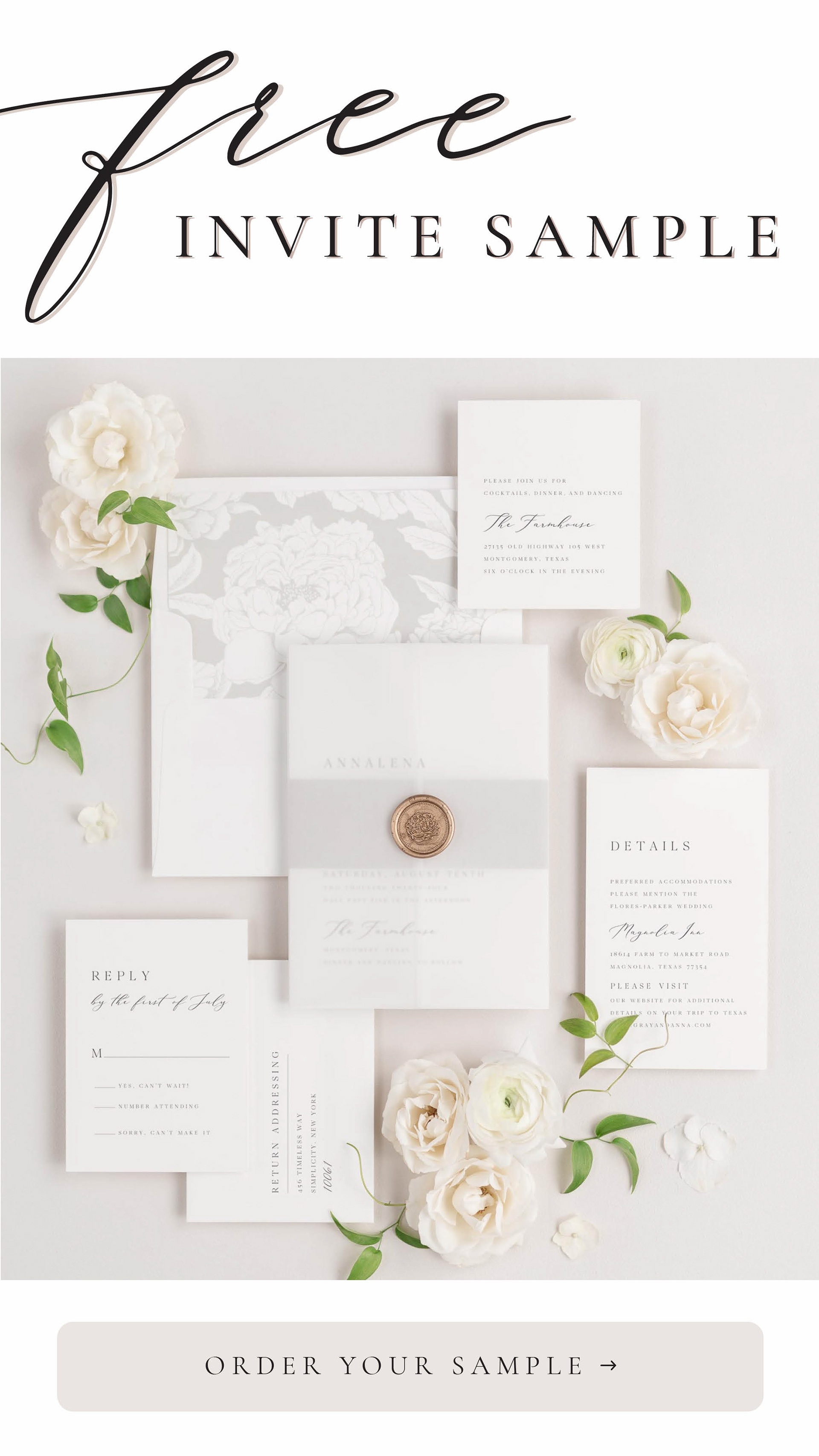
The Idea Behind the Ad:
This ad was designed to be reminiscent of our original ad (shown first on this page), as the CEO loved that ad especially, and that style is a great way to show off the product overall.
This ad was designed to be reminiscent of our original ad (shown first on this page), as the CEO loved that ad especially, and that style is a great way to show off the product overall.
Again, I wanted to show multiple products from this invitation suite,
so brides would know that Shine offers everything they might need for wedding stationery. I found this audio and thought that the building tension and quick pace were perfect. You get to see enough of the photos to be intrigued and want to see more. The benefit is that the video is only about 5 seconds long, which works in our favor with how short attention spans are these days.
so brides would know that Shine offers everything they might need for wedding stationery. I found this audio and thought that the building tension and quick pace were perfect. You get to see enough of the photos to be intrigued and want to see more. The benefit is that the video is only about 5 seconds long, which works in our favor with how short attention spans are these days.
I also thought that this more modern style of invitation would play well on TikTok, as the audiences are younger. This also turned out to be a good instinct and resulted in the least expensive samples we've ever gotten on TikTok.
Launched on:
TikTok
TikTok
Static Pinterest Ads
The Thought Behind the Ad:
Pinterest was the very first platform that I worked on for Shine. It proved to be a difficult platform, as Shine's understated, luxury style doesn't always perform as well when competing on busier platforms, like Pinterest.
Pinterest was the very first platform that I worked on for Shine. It proved to be a difficult platform, as Shine's understated, luxury style doesn't always perform as well when competing on busier platforms, like Pinterest.
After several different failed ad styles, I finally decided we needed to try something grabbier than we might
normally go for. I pitched this bold headline style to the CEO and she was excited to give it a shot to see if that would help us on this platform in particular.
normally go for. I pitched this bold headline style to the CEO and she was excited to give it a shot to see if that would help us on this platform in particular.
Turns out that the eye-catching headline was just what we needed on this platform!